One of my first projects for the University of Illinois was the 2018–2019 issue of On Campus, a guidebook and magazine distributed across campus to prospective students, visiting families, job candidates, and other guests attending tours, visit days, and interviews.
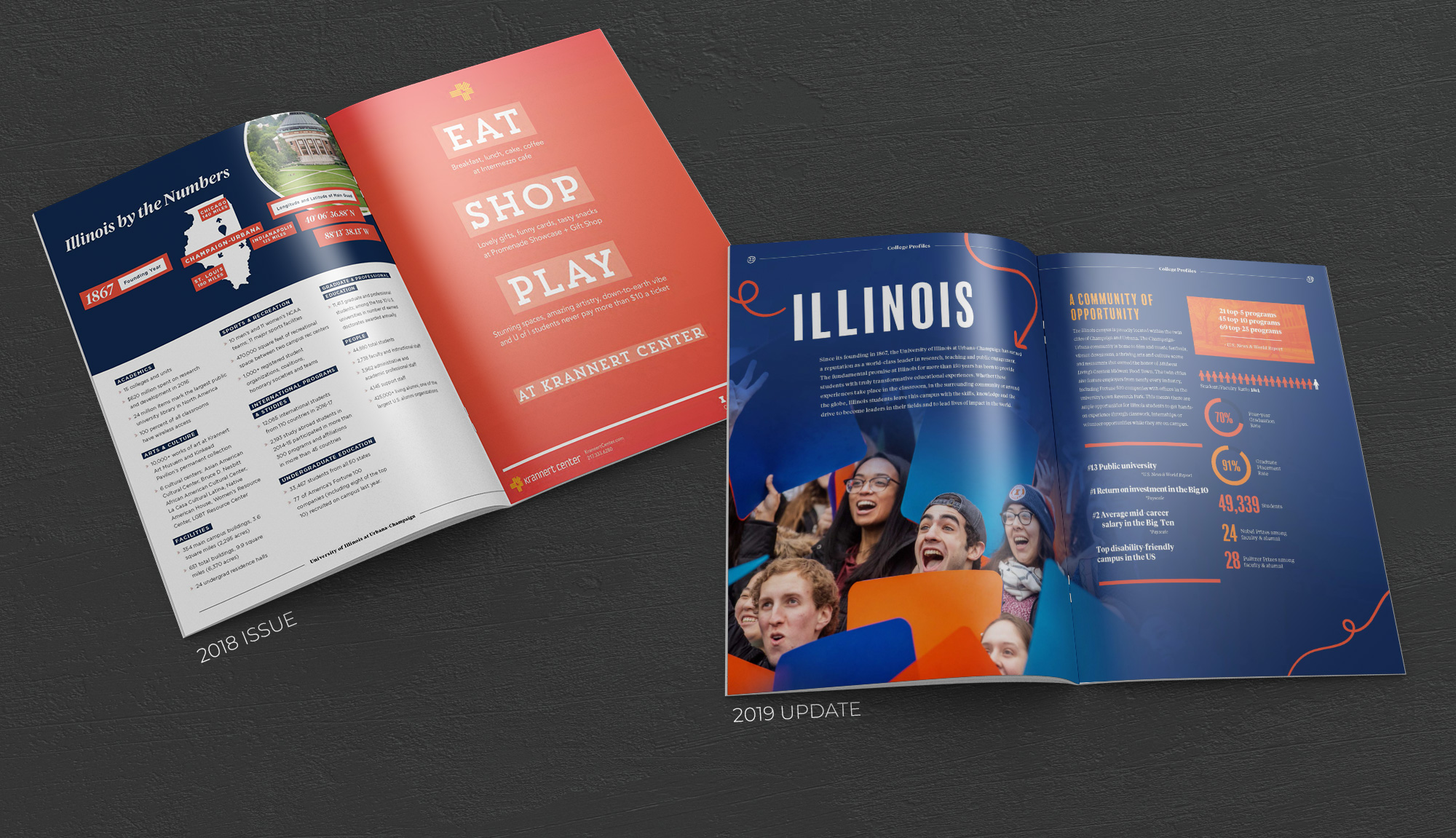
For the 2018 issue, I was responsible for laying out the publication. I focused on streamlining the design system by creating reusable text styles and page templates, improving consistency while optimizing the production workflow. I also used the project as an opportunity to learn the publication’s content, audience, and structure, laying the groundwork to develop a stronger and more useful piece the following year.

Before starting the 2019–2020 issue, my team surveyed both campus offices that distributed the magazine and students who had received it during a visit day or tour. The feedback gave us a clearer understanding of the guide’s audiences and how they were using it.
We learned that the primary readership was prospective students, including many who had never visited campus and received the guide at off-campus college fairs. A secondary audience included prospective faculty members and researchers visiting campus for interviews.
The findings revealed an important gap: the campus map was the most valued feature for distributors, but readers found it difficult to use. Students were most drawn to the photography, while editorial content—though meaningful to featured campus groups—was rarely read by the guide’s primary audience.
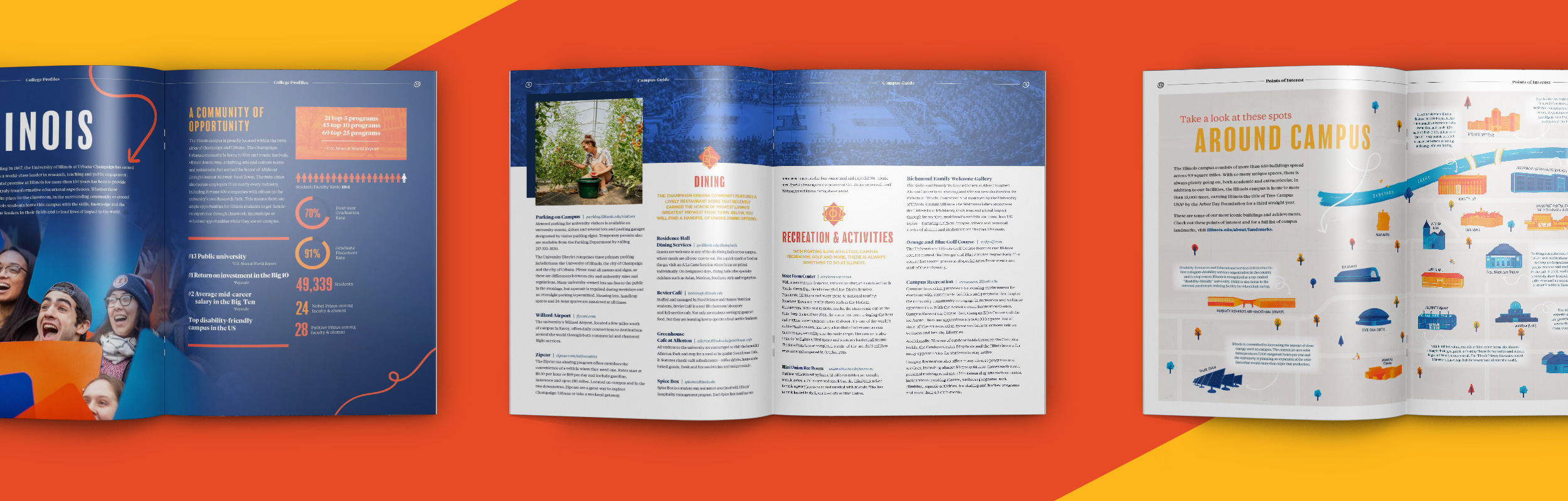
For the 2019–2020 publication, I focused on creating a guide that conveyed the energy of campus and gave readers a fuller sense of everything happening at Illinois. I wanted to position On Campus as a critical first impression for people who had never visited campus—or who had only experienced a small portion of it during their time here. To better serve that audience, we made several significant changes to the publication’s content, format, and visual direction.
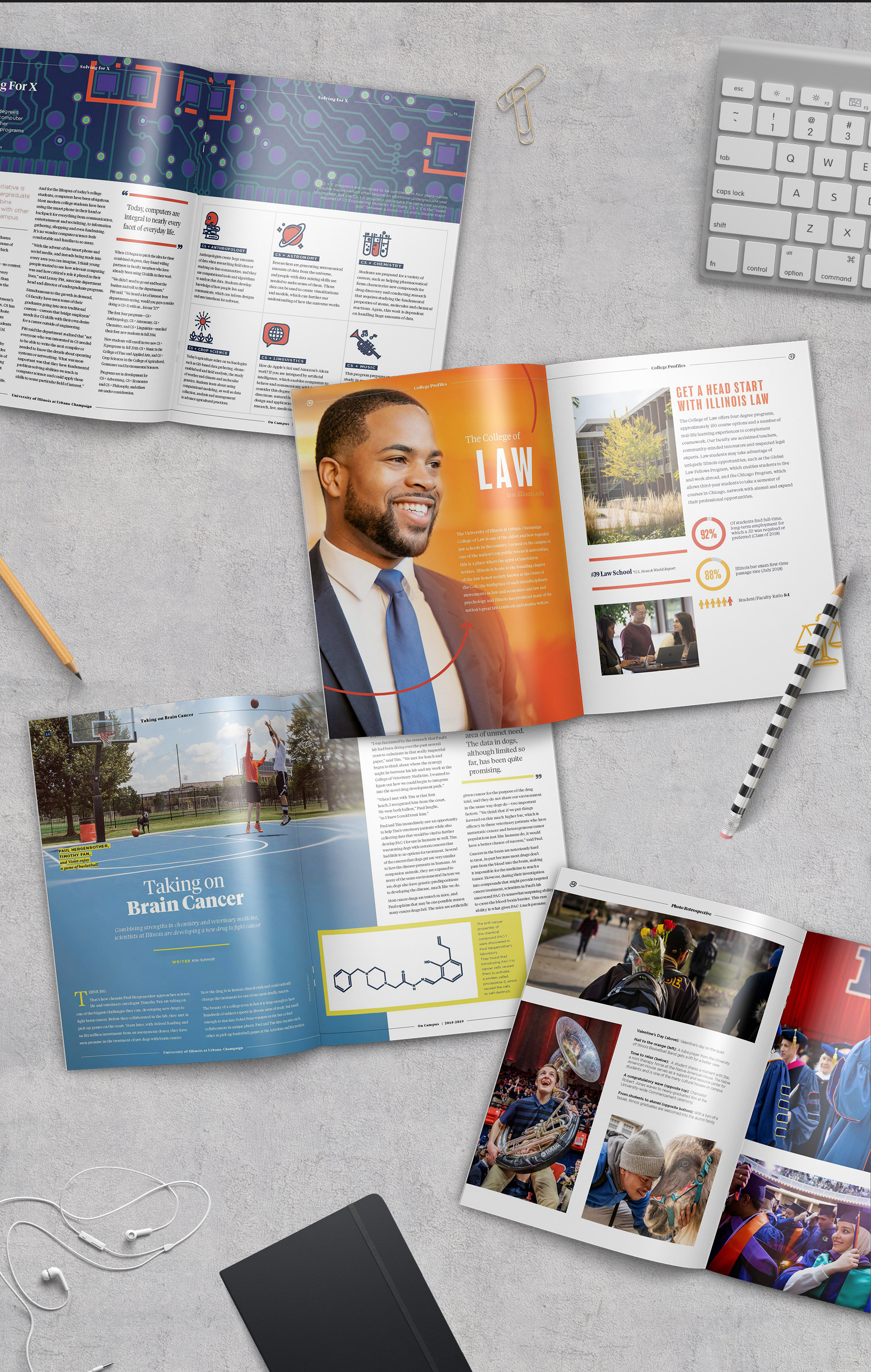
We removed the long-form editorial stories and replaced them with a more scannable university overview, including bite-sized stats and facts for every college. This allowed readers to quickly understand the breadth of academic opportunities across campus.
Photography became a much larger part of the publication. I worked with schools and units across campus to source their strongest images from the previous year, then used that collection to create a slice-of-life photo feature that could help prospective students imagine the campus experience, even if they had not visited in person.
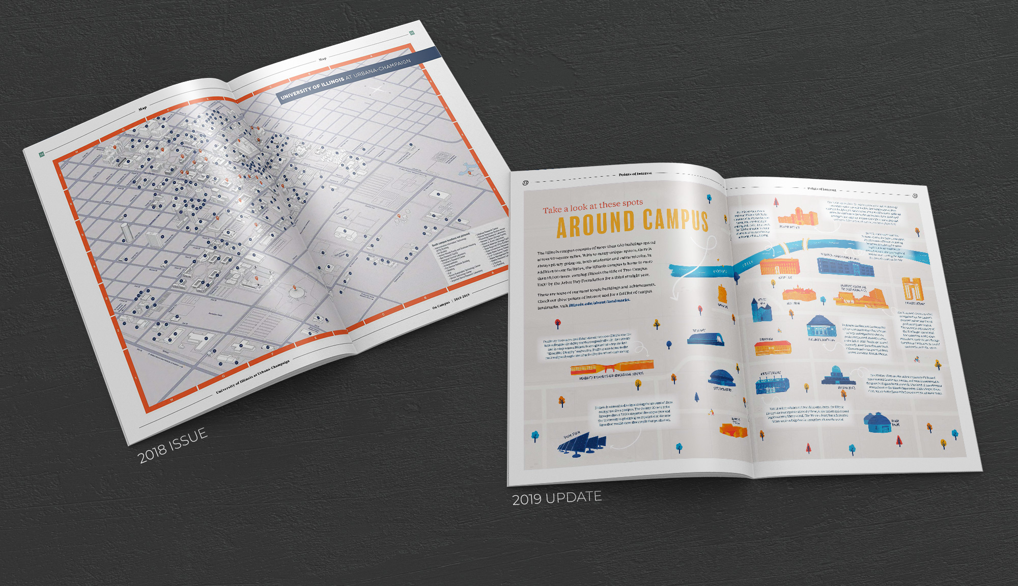
The campus map also needed to be rethought. In the previous format, the map was too complex for the size of the publication, making both the map itself and its key difficult to read. I took the map in a more illustrative direction, focusing on key campus landmarks and their relationship to one another. The result was a more inviting, useful piece that highlighted what makes the campus unique rather than attempting to document every detail.
We also reconsidered how the guide represented the surrounding community.
Previous editions listed only a small number of dining, lodging, and entertainment options because the university could not appear to favor specific businesses. While accurate from a policy standpoint, that approach unintentionally made the area around campus feel limited. I helped reshape this content to better reflect the vibrancy of the surrounding downtown by removing overly specific listings, keeping the campus features that truly stood out, and adding broader statistics about the range of dining, lodging, and entertainment options available nearby.
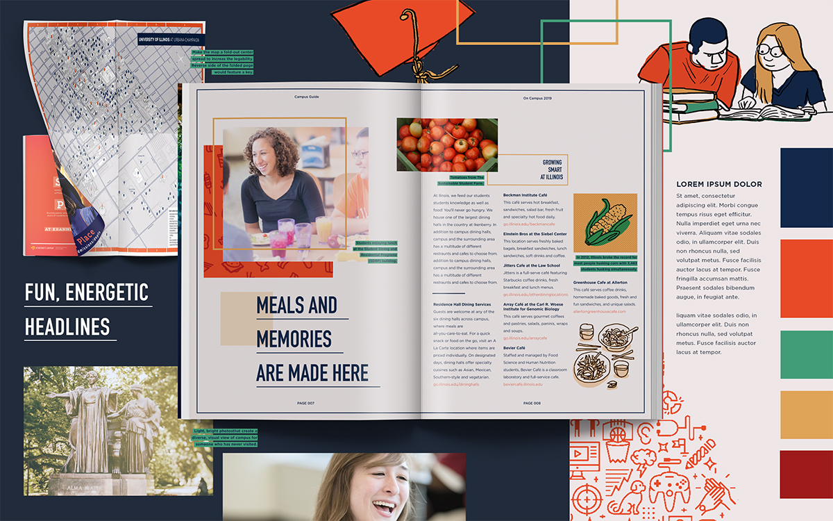
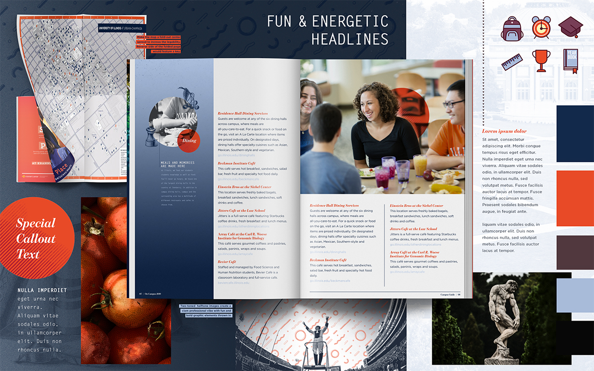
To establish the visual direction, I developed two initial concepts that brought more energy and personality to the guide for prospective students. The final design combined the line art and color palette from the first mood board with the patterns and graphic photo treatments from the second, resulting in a publication that felt more dynamic, welcoming, and reflective of campus life.